Last night, on the 20th March, our school held a 'Creative Arts' evening, showcasing all of the students in the art department's work: these included subjects, such as drama, music, textiles, photography and, of course, media! We held a public audience and previewed our music videos. As the evening progressed, we found audience members (round the age of our target audience) for critical evaluation and feedback.
Below is a video providing this response by two of our media peers, Tatenda and Miles. In this video, they include how the music video personally affected them, which in turn practices the "reception theory":
http://www.youtube.com/watch?v=ckaYBevjB7k&feature=player_embedded
Wednesday, 21 March 2012

Friday, 24 February 2012
Indie/Rock Album Covers*
I have researched album covers from the same genre as Muse to familiarise myself with the typical conventions of the indie/rock album covers: the layouts, the colours, the font etc.
Death Cab for Cutie
Death Cab for Cutie produce more soft indie music as opposed to many other bands in this wide urban music genre, and the soft pastel “neutral” colours used in these album covers help reflect the band’s easy-listening music. My particular favourite of these covers is the ‘Transatlanticism’ album, because it is simple with a significant image (the bird) being the focal point with a plain and complimentary background. I also prefer this back cover because the typical conventions (the list of the song titles, barcodes, company information) but formatted in a simplistic way; plus the colour scheme has been kept as well as the link of the red ribbon from the front cover (this is just a feature that works well) keeping the theme with the appeal of the indie/rock audience in consideration.

Gorillaz
The Fray
...... My favourite album cover is ‘Heartbeat’, and not only because it is in my favourite colour, but also because I like the silhouetted unconventional style of band shot – them being “spread apart” – which works well with the actual layout of the album cover design; the border at the top is not a typical feature but works well with the album theme in mind. The back cover design I like the most is from the album ‘2’; this is my favourite because I love the typography conveying the indie/rock style as well as the of the wall also highlighting this genre more.

The Kooks
Thursday, 23 February 2012
Photoshoot Comparisons
Before we actually take the band shots, I wanted to look at existing band shots from bands in the same music category as Muse. Here are two:
Muse


These shots are strong and this particular pose would be perfect for our ancillary tasks, because there is the eye contact of the band members to the front (which would be to the reader/viewer) which creates that immediate connection. Also, these shots convey their social style (which is indie/light rock) which appeals to the public in this class.
Here is a comparison of these images and our photoshoot photos of the band:


Muse

These shots are strong and this particular pose would be perfect for our ancillary tasks, because there is the eye contact of the band members to the front (which would be to the reader/viewer) which creates that immediate connection. Also, these shots convey their social style (which is indie/light rock) which appeals to the public in this class.
Here is a comparison of these images and our photoshoot photos of the band:

We have tried to make our band shots look as real and "professional" as possible, and I think (following the simiar compositions) we have "pulled this off".
I have also found other band shots and have compared them to our band editions:
Coldplay

This is another band situated in the same genre as Muse, and it is clear that we have adapted this band shot in our own photos. The whole concept is striking and builds a strong and appealing image for our band; also, the use of "gaze theory" has been adapted here also, which appeals to the audience.
Kings of Leon

Kings of Leon are band also categorised in the "rock/indie" genre of music, and so attract a similar audience as Muse. Their band shot is set at an angle unconventionally which I absolutely love! This is what our image is based upon, and I think it has been constructed quite well. Another aspect of this image which makes it strong, is the use of the eye contact of the band members to the front' this immediately creates a connection of the viewer looking at the poster.
Wednesday, 22 February 2012
Photoshoot
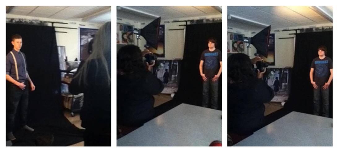
On 22nd February (yesterday), the group gathered together and shot the photos we will use for our ancillary tasks - these included the band shots and a few snaps for the photos for the narrative.
I think the photoshoot went well, for we used the effective colour backdrop in the studio (the black cover) which contrasted well with the dimmed lighting; this lighting really looked strong on the "models", for there was a bold shadow cast on the face creating a sense of mystery setting a strong dynamic theme for the album. I found the band shots, and the way they were assembled, very strong, and (as previously recorded in my last blog) they reminate similarities in professional band shots/stances.
Here are my favourite photos of the shoot:


I think the photoshoot went well, for we used the effective colour backdrop in the studio (the black cover) which contrasted well with the dimmed lighting; this lighting really looked strong on the "models", for there was a bold shadow cast on the face creating a sense of mystery setting a strong dynamic theme for the album. I found the band shots, and the way they were assembled, very strong, and (as previously recorded in my last blog) they reminate similarities in professional band shots/stances.
Here are my favourite photos of the shoot:


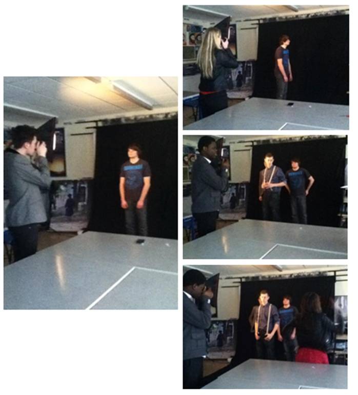
Here are a few "behind-the-camera" pictures of the group taking the shots. We really enjoyed this task and, in turn, it has been successful.
Monday, 20 February 2012
Location Scouting Footage*
The group decided to start filming for the music video on 30th November.
Before we began filming, we all discussed possible locations on where our music video scenes will be based. We started by looking around the school and decided to film on the school stage the band shots (to reflect a band performing at a concert), however after feedback from Mr Palmer we decided not to film on the school premises; it would not be a suitable location for ur music video. Following this constructive criticism, we decided to change location suiting the theme of our music video and genre more appropriately - to convey the mise-en-scene more effectively.
So, our locations will be:
- An Estate
- Woods/Heath
Today, Kike and myself went to one of the possible locations, Bostall Heath, with Katharine and filmed the setting; this enabled us to visualise some of the narrative scenes in our music video. We took recordings of the heath (Kike is the audio, however it is very hard to hear her with the wind being so strong and loud :/ ):
This is our quirky actress, Katharine, who plays one of our main characters in our music video. One of our possible locations is the heath, and this scene will involve the significant “kissing” scene that sends our main character not “feeling good”. We have chosen this as a strong possible location for this scene, because there is the contrast of the open space of the heath as well as the hidden and secreted shroud of trees. They symbolise the secret of Katharine’s character cheating on our Charlie which makes it all the more enticing.
Despite the horrific quick zoom, a possible main tree that will be featured is this one. We scanned the whole of the heath’s trees and made a choice to consider this one; the shape is distinct as well as the background behind it being open giving our other characters space to perform.
Band Location
To really portray our chosen themes of sadness, depression and heartbreak, we decided to choose an estate to really visualise this chaos and mass of emotion (to relate to teen angst) and so found this old desolate bulding filled with this clutter and "destruction" - it belonged to a friend's dad, so with permission, we were allowed to film this as the set of our main location. We found the mise-en-scene for our music video would be conveyed well in this location, for not only does it look unconventional, but an "abandoned house" is a perfect location for our urban based target audience.
 |
| Band Location - with Charlie |
 |
| Zoomed shot of the back of the building |
 |
| Just clutter and mess!! |
Friday, 6 January 2012
DVD Covers*
I have researched a variety of different DVD album covers (from a mixture of the music genres in society) to gain a concept of what conventions I would have to exceed whilst developing my own Muse album DVD front cover for my ancillary task. Here are a few examples:


It is amazing how diferent each one is, in terms of style, layout and colour, which also conveys the similarities of the covers and their appliances of the typical conventions.
My particular favourite of these covers is 'The Pretty Reckless' one:

The reasons why I favour this cover are:
- I love the simplistic format that this cover has developed; the main front image is simple, central and effective; the titles/headers are clearly found in the appropriate places and the distributor's information is clearly identified at the bottom on the back cover - in some DVD covers, these conventions are hard to find by the "chaotic" cram of information and distracting background design; covers that convey this are the 'Rihanna, Good Girl Gone Bad Live', 'Britney Spears, Femme Fatale' and the 'Evanescence' DVD album cover.
- I also love the representation of Taylor Momsen's "rock-chic" image by the use of colour and the "teenage girl" qualities of the design (the heart sketches, the pink font etc) This targets a younger audience in this rock genre, both female and male: female - by the typical "teenage girl" approach in deisgn, colour and whole concept of the cover, and male - the provocative use of "gaze theory" of Taylor Momsen's pose in her stylised and revealing trade-mark attire (the Doc Martins, the black laungerie with blonde extensions and heavy black eye make-up).
This is the cover I will base my DVD cover on!
Here are a couple examples of Muse's previous album DVD covers:

The general similarities in the two covers are uses of dark colours; the "sci-fi" theme of the main images and the main appeal to adolescent boys in society by the design approach. They also signify Muse's "electryfying" and "static" image as a band.
Thursday, 5 January 2012
Subscribe to:
Posts (Atom)